Presenting Architecture, Design and Planning Graduate Work
adpgradshow.com is a website showcasing the work of graduating students from the University of Sydney’s School of Architecture, Design and Planning.
Overview
Every year, the School of Architecture, Design and Planning (ADP) at the University of Sydney hosts a public graduation show, featuring the work of its graduating students across the school’s disciplines–including architecture, interaction design and urban planning.
As part of the event, the school commissions a bespoke website that reflects the unique visual identity of that year’s show. The website not only serves as an archive of student work, but also extends the reach of the exhibition to a broader audience–including friends and family who can’t attend in person and prospective students interested in the programs.
For the 2024 graduation show, I was commissioned to design and develop the website to translate the show’s visual identity into a functional digital experience.
Goals
The key goals for the 2024 ADP Grad Show website were:
- Translate the visual identity of the graduation show into a functional web design.
- Design clear information architecture to support discoverability and ease of navigation across more than 300 student projects.
- Develop a fast, accessible, and reliable website that performs well across mobile and desktop while meeting accessibility standards.
Role and Process
I worked closely with ADP’s Senior Project Officer, who coordinated the overall exhibition, and their Web Coordinator, who handled incoming submission content from students.
The team provided the year’s visual identity up front, including colors, typography and illustrations, which I used as the foundation for the website design. I worked in two phases–first design, then development–with regular check-ins to gather feedback and ensure alignment with the show’s evolving needs.
Designing the Website
I began by working with the project officer to define the website’s primary users and their goals. We identified three key groups: graduating students, family and friends unable to attend in-person, and prospective students exploring the ADP’s programs.
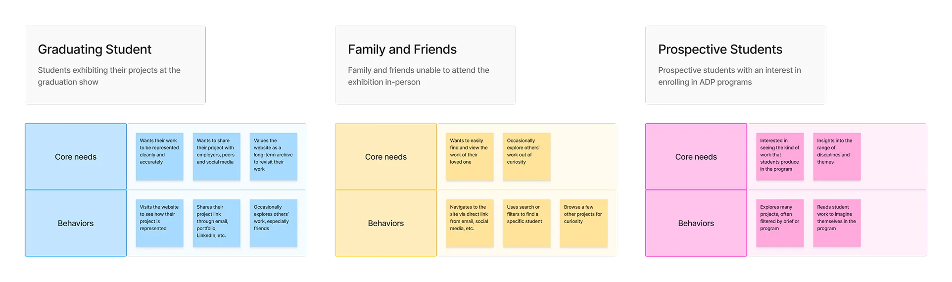
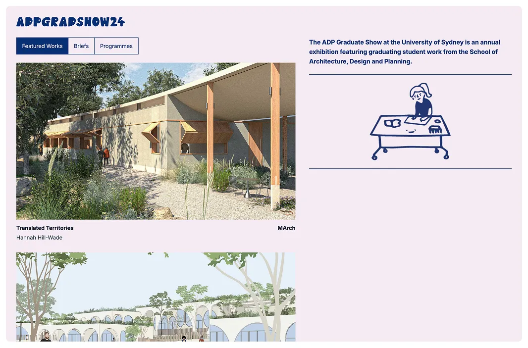
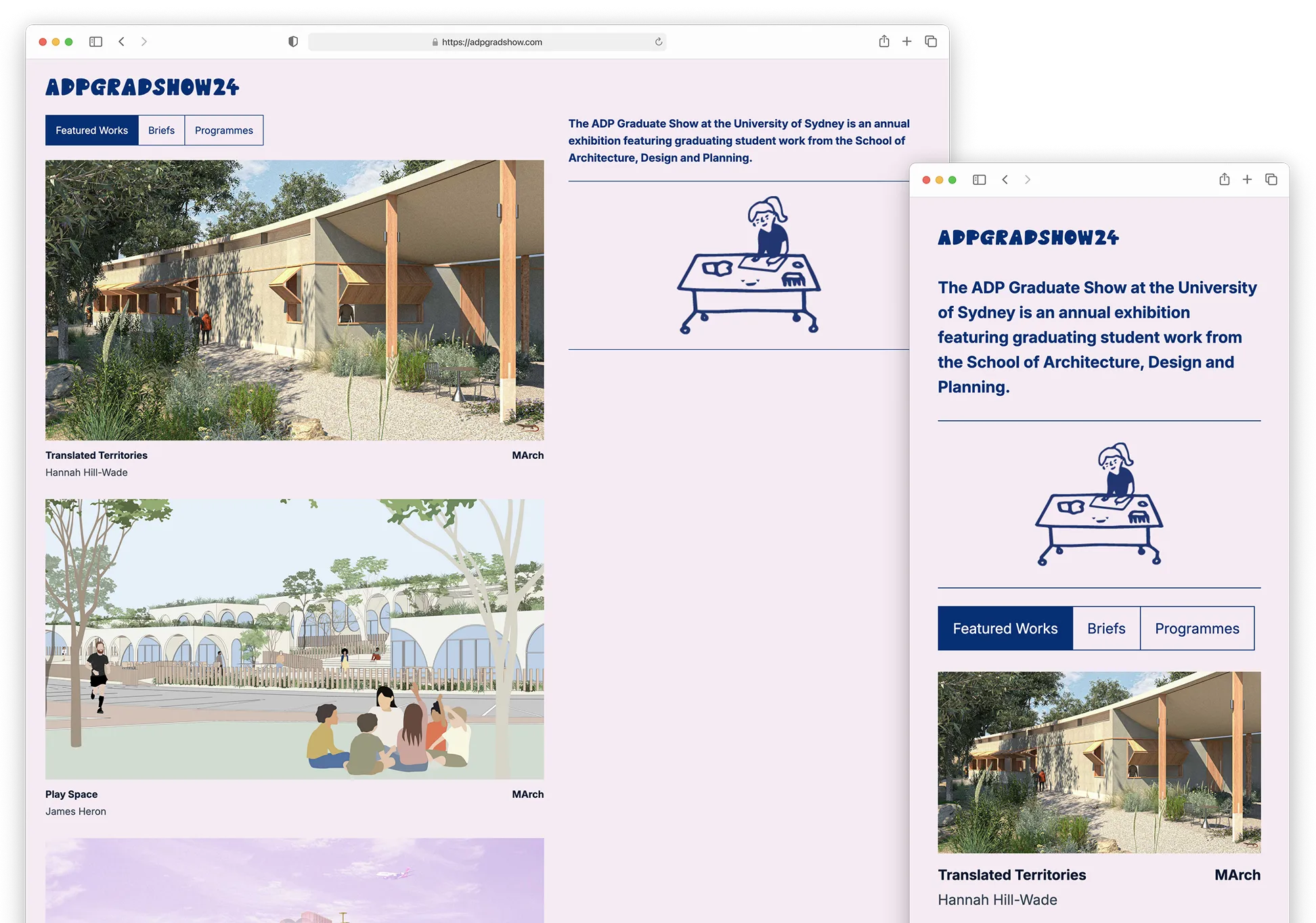
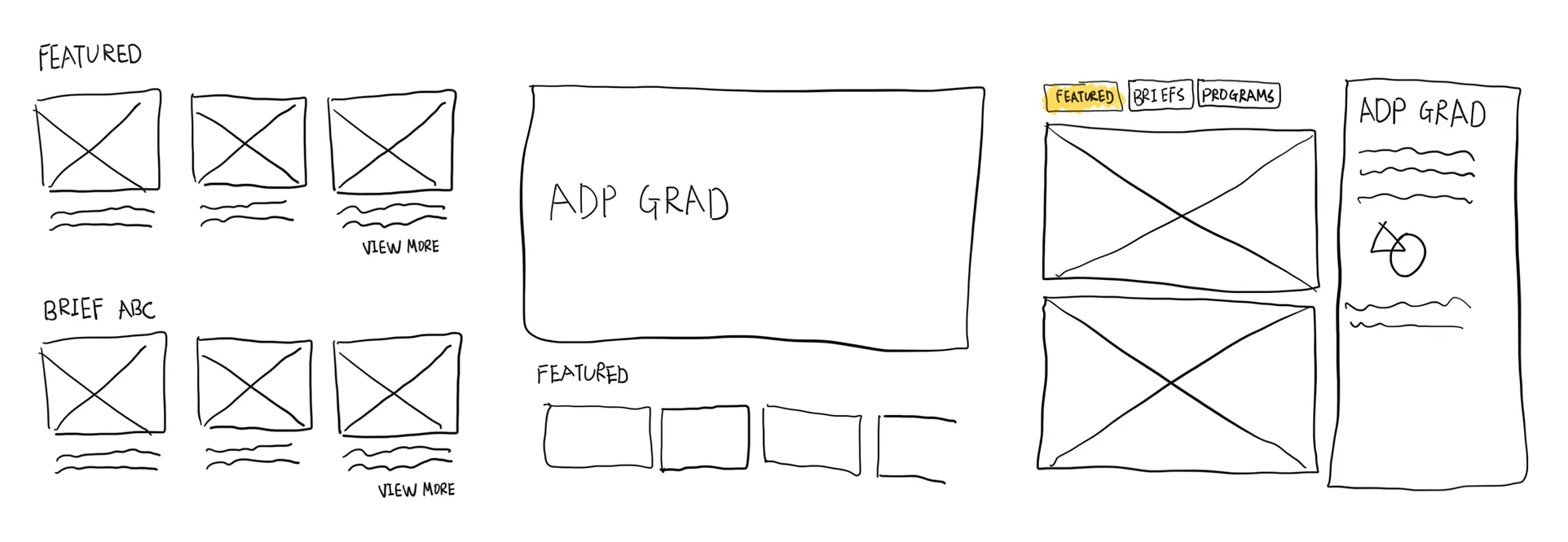
Keeping these archetypes in mind, I designed an information architecture that supports both casual exploration and targeted browsing. The homepage highlights staff-selected projects, while filters by brief or program help users find specific types of work.
I also considered adding a search feature to help users quickly find specific projects–for example, a parent looking for their child’s work by name. However, implementing full-text search across 300+ projects required a more advanced setup than the project timeline allowed, so it was set aside for future consideration.
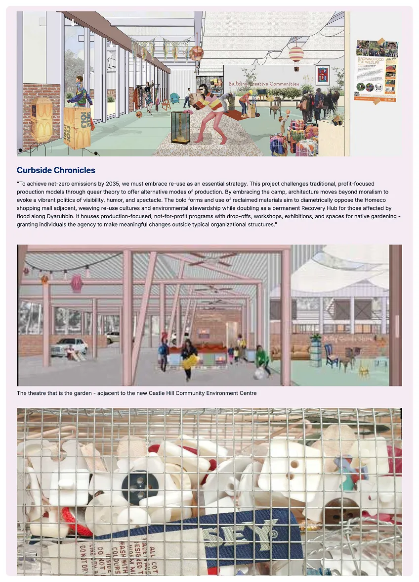
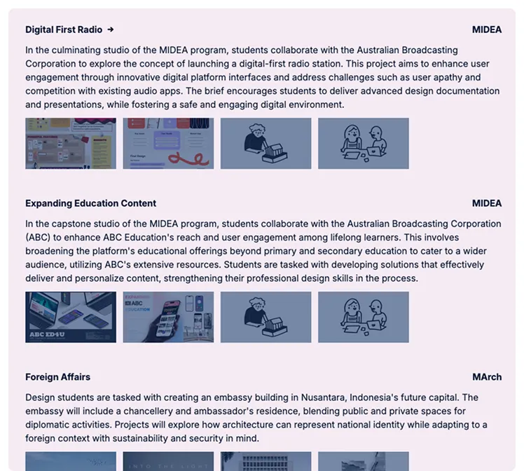
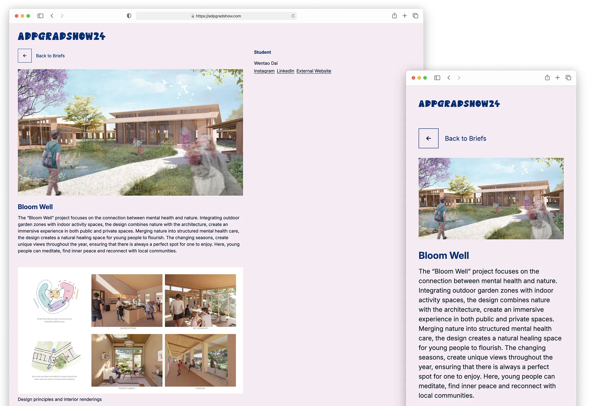
In designing the layout, I explored several options and chose a split-panel structure. When browsing through a list of projects, the large main panel provides ample space for cover images. When viewing an individual project, the layout adapts well to images of varying size and quality—a factor outside my control, as all content was submitted by students.
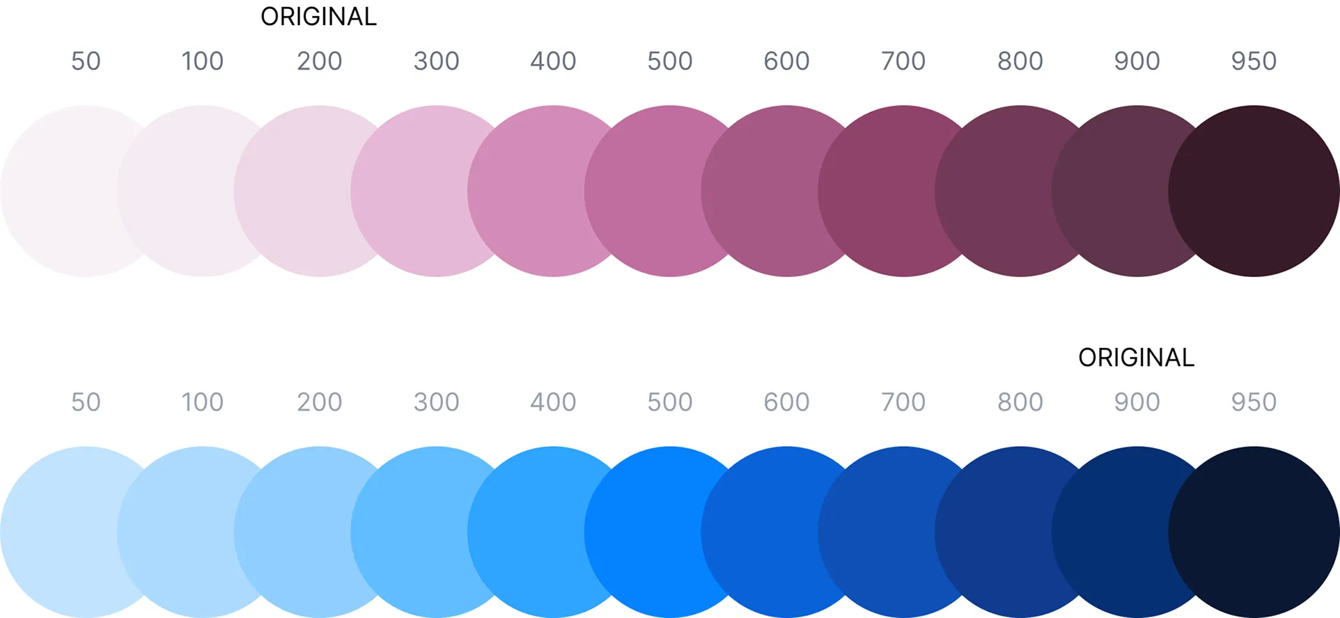
The site’s visual identity was based on the colors and typography provided by ADP. However, the original palette lacked accessible color pairings. To address this, I derived a new color palette by adjusting saturation and brightness while preserving the look and feel of the original identity.
Developing the Website
With the layout and color palette defined, I moved into development–switching between Figma and code as needed. When working solo, I found that gradually building and refining in both design and code allowed for a more flexible and iterative process.
I chose to build the site using Astro, a static site generator ideal for content-heavy websites like this. Unlike dynamic web apps, all project data on the website is static, making Astro a great fit in terms of simplicity and performance.
One challenge was collaborating with the web coordinator to ensure the student-submitted data was clean and consistent. By defining a clear content schema early on, we were able to catch and correct issues before they made it into the website.